Showing posts with label Development. Show all posts
Monday, 22 October 2012
Client Project: Internal: Devlopment: Part 1
I have completed various mock up designs for scene one and two of my promotional advert to get an idea of the logistics behind my project, I believe I am going to have to produce one scene at a time and then dynamically link the pre- compositions after with a 3D camera in after effects:
I have also begun arranging suitable locations to film my sports performance scenes in, I am in the process of talking with Clair Moore, the head manager at NTU's city campus gym to see if I can get permission to film in there with my actor and cameraman. A green screen session has also been arranged for next week. Other than that I have been on the lookout for good textures to incorporate into After Effects assets. A selection of my favourite are below:
Thursday, 12 April 2012
Tuesday, 21 February 2012
Design Practice 3: Assignment 2: Projeted Visuals: Development: Part 1
There has been heaps of development since the last design practise 3 post I wrote here, two separate filming sessions have gone by, scenes have been built up in after effects and tweaked. Finally new ideas entirely for scenes have formed around the development of my existing ideas and I'm working on incorporating them into the 4 and half minute music video.
Lets start with the filming sessions as that's a chronologically suitable place to start: my first session fell last Wednesday and was a combined arrangement by me, Jordan Brooks and Joe Burns, we helped each other set up equipment and act/model in each others videos. The lightning went well, we had an evenly lit green screen with no shadows and a correct exposure on the 7D. A main outstanding problem I believe disrupted filming and limited what I could achieve was the inherent time restrictions we had on our DSLR camera.
I hate being rushed and that's exactly what it felt like, we had the camera 10 - 4 for one day so some scenes didn't turn out the way I'd hoped, it was cramming at it's finest. I later had a contingency shoot day the following Monday with Chris Thorby which allowed me to replace previous bad footage and collect new material, I also had the chance to experiment with my new time lapse timer in Nottingham Square, i was pleased with the result.
Moving on, I'm not going to document the entire process of editing my assets, as frankly it would bore and take to much space, I'll give you a basic overview of progress. The main scenes I have started work on and subsquentially almost completed are:
Scene 1: Man In Mirror:
Scene 2: Mirror Scale
Scene 4: Flickering Room
Scene 9: Alive in Toilet Mirror
Scene 13: Time lapse at Nottingham Square
New Scene: Passing through mirror
In conclusion I proberly over estimated what I needed to film to make this video, I'm about 2 minutes into the song and i don't think I'm going to need to produce every last scene, so a few will be scrapped. Besides resources for the project are dwindling so I'm going to use what I've got for now. Another thing to note is that I do think the whole thing is a bit after effects heavy, I'm starting to feel like a computer hermit, I'm looking forward to the 90 second drama FILM next project.
Friday, 18 November 2011
Design Practice 3: Assignment 1: Development: Part 4
Well the production stage of my political advert has now finished, It has took a lot of organization and scrounging, but in return I have gained one of the most aesthetically pleasing sets in the group, along with a semi-decent message. The main set for all the scenes was located In the countryside of Matlock Derbyshire, a whopping three hours drive away, and as I didn't own a car I had to rely a lot on my crew members (Jordon & Paul) for transport.
Off course petrol money had to be reimbursed for the expense of the long journey, which meant I realistically only had one take as my budget was already overflowing. In total this project racked up around £60 and 10 hours of filming, not to mention many more hours poured into pre-production, It has really put matters into perspective, the pure amount of effort you have to put into film, even for a 30 second project is astounding.
Production Stills:
Some big pointers were; to never underestimate the amount of time needed to film even a short piece of footage, that shot lists are crucial, they were literally my lifeline on set, I referenced them more times than I can count. Getting to know the equipment a day (preferable weeks) before a shoot is also important and can save heaps of time. Furthermore always check you have the correct equipment and hire out spares, half our equipment was faulty or missing and finally don't hold out on your crew members, I am so glad I had three members rather than two, the roles demand more attention than one person can provide.

Post production has now started and I estimate to complete the project on time, titles, colour correction, VFX and soundmixing all need be completed by 25/11/11. A big thank you to Jordan Brooks (actor), Daniel Bissill (lighting), Pam Fletcher (location) & to Paul Dobson (assistant producer) for making It all possible.
Off course petrol money had to be reimbursed for the expense of the long journey, which meant I realistically only had one take as my budget was already overflowing. In total this project racked up around £60 and 10 hours of filming, not to mention many more hours poured into pre-production, It has really put matters into perspective, the pure amount of effort you have to put into film, even for a 30 second project is astounding.
Production Stills:
![]() |
| Untouched |
![]() |
| Daniel Bissill alters the focus The set is dressed for the cooking show |

![]() |
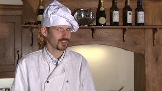
| Jordan Brooks as 'Chef Gusto' |
![]() |
| Widshot of the cooking show set |
Wednesday, 2 November 2011
Wednesday, 26 October 2011
Design Practice 3: Assignment 1: Development: Part 2
So since last weeks feedback session I have descided to narrow my ideas down and focus on the intrinsic message I wish to portray, I have descided to develop the concept of food education as this is the treatment that got the majority approval at show & tell. In a nutshell my advert is aimed at:
Educating and getting people interested in the ingredients found in their food, urging them to question the standard and quality of certain ingredients and ultimately influence them to find out how they can eat healthier.
I will visually represent this via a cooking show, this is explored in the storyboards below:
Educating and getting people interested in the ingredients found in their food, urging them to question the standard and quality of certain ingredients and ultimately influence them to find out how they can eat healthier.
I will visually represent this via a cooking show, this is explored in the storyboards below:
Friday, 21 October 2011
Show & Tell #1
Well the first show and tell session today was enlightening to say the least, It pretty much confirmed my self-doubts that my ideas were too unstructured, that they required clearer plot and core purpose. My original gust concept was to try and promote traditional values when it came to food, such as knowing where your ingredients are sourced and taking the time to cook your meal with pride, but at the same time I didn't necessarily want it to be just about healthy eating. I was originally going to show this via a transition of people buying from organic butchers and greengrocers to people ordering fast food, but came to the conclusion that it was neither innovative nor memorable enough. So my ideas pretty much spiralled from there, from cooking shows and interviewing children to spoofs, although these new ideas were fresher and more controversial they didn't hold the original concept of promoting traditional values when it came to food. I believe I need a new concept.
Points made in show & Tell
Food education - Educating and getting people interested in the ingredients found in
their food, urging them to question the standard and quality of certain ingredients and ultimately influence them to find out how they can eat healthier.
A preliminary idea on how to visually represent this is with my cooking show idea, the ingredients of a particularly bad processed fast food recipe are added to a mix, while the chef simultaneously informs the audience whats going on. It ends with the disturbing ingredients being transforms into a burger (or likewise) and being held up to the audiences face, In which the Chef states "Now you know where it come from do you still want it?"
Points made in show & Tell
- Narrow your ideas down
- Think educational
- More clear on what you want to do
- Think about your core idea, change it.
Food education - Educating and getting people interested in the ingredients found in
their food, urging them to question the standard and quality of certain ingredients and ultimately influence them to find out how they can eat healthier.
A preliminary idea on how to visually represent this is with my cooking show idea, the ingredients of a particularly bad processed fast food recipe are added to a mix, while the chef simultaneously informs the audience whats going on. It ends with the disturbing ingredients being transforms into a burger (or likewise) and being held up to the audiences face, In which the Chef states "Now you know where it come from do you still want it?"
Wednesday, 19 October 2011
Sunday, 8 May 2011
Design Practice 2: Interactive Spaces: Development (3)
To finish off I added a contact me page and polished up the background image, The only issue is that I'm not 100% positive that my pages work on all monitors. I then went about finding a decent web host and registering a domain name, In the end I registered a domain at GoDaddy.com and purchased a web host plan from HostGator.com after reading good reviews for the two. If your looking to do the same thing make sure you search for coupon dealers, I got my GoDaddy domain for $4.37 /y instead of $7 and got -$7.60 of my monthly HostGator plan, meaning my first month was only $0.01. Then it was just a case of figuring out how to link the domain and host together and uploading my site using the FTP client FileZilla, the HostGator tutorials were perfect for newbies and easy to use. So after a final activation call to America to activate my account I am finally live, I will getting feedback of people assessing my site from different monitors and browsers to check every things working. I've basically published this site for fun and for end-of-year presentation purposes.
Website is live and can be viewed at:
www.mediadobson.com
Website is live and can be viewed at:
www.mediadobson.com
Sunday, 1 May 2011
Design Practice 2: Interactive Spaces: Development (2)
Just a quick recap, the main addition since last time is a video gallery, It uses javascript to ease in and out of view when the uses clicks it's thumbnail, I like it a lot and I works perfectly in creating the allusion that the videos are inside comic book boxes.
I had some good feedback on Wednesdays lecture, so everything seems to be going good. I really only have to add a 'contact me' page and do a bit of tidying up like, such as making the banner a link to the homepage and altering the opacity of the background image. I will also be diving into finding an online host and domain name shortly, to get my website online.
Problems:
A few problems to note are that my website works perfectly on Firefox (Tested on 3 different monitors) But on Internet Explorer everything shifts up slightly (accept on my monitor), This could be due to the use of absolute positioning. I learnt that in my exception using height pixels for div's was acceptable, I avoided this originally as I was informed to and used absolute positioning to put text and images on top of my divs.(Everything was being pushed down using padding, and It was the only way I could figure out how to position over background div images while maintaining the visibilty of the background image).
I have decided that the shifting up is an acceptable problem and will not be altering all my pages code to fix the div positioning, It still works suitable and serves it's purpose, It was a school boy error and I will have to use firefox to showcase my work and explain my problem in the presentation.
I had some good feedback on Wednesdays lecture, so everything seems to be going good. I really only have to add a 'contact me' page and do a bit of tidying up like, such as making the banner a link to the homepage and altering the opacity of the background image. I will also be diving into finding an online host and domain name shortly, to get my website online.
Problems:
A few problems to note are that my website works perfectly on Firefox (Tested on 3 different monitors) But on Internet Explorer everything shifts up slightly (accept on my monitor), This could be due to the use of absolute positioning. I learnt that in my exception using height pixels for div's was acceptable, I avoided this originally as I was informed to and used absolute positioning to put text and images on top of my divs.(Everything was being pushed down using padding, and It was the only way I could figure out how to position over background div images while maintaining the visibilty of the background image).
I have decided that the shifting up is an acceptable problem and will not be altering all my pages code to fix the div positioning, It still works suitable and serves it's purpose, It was a school boy error and I will have to use firefox to showcase my work and explain my problem in the presentation.
Monday, 25 April 2011
Design Practice 2: Interactive Spaces: Development
So I've set up the overall comic book template I will be using for my online portfolio, I'm creating a background of various comic books scatted on a wooden desk with a large comic book open in the center of the page, this will give the illusion of reading my portfolio on the canvas of a comic book. The hardest part surprisingly was finding an image of a comic book/magazine that was folded over on its self with a visible spine to place in the middle, I had to take one of my own magazine, fold it over and scan it to get a suitable image. Various photoshop effect are placed on the header and the canvas to create a comic book feel, effects such as chrome and poster edges.
![]() |
| Scanned magazine spine incorporated into my template. |
Here is an example of quality comparisons when it comes to youtube, we learnt that you should always consider the codec, format and quality of images and videos you embed on your site, If your web page loads to slow, viewers will simply move on to different sites. .jpeg are used for photos, where as .gif and .png are better for banners and buttons, they also have a lot less bits of colour in them. It is crucial to minimize the quality of images and videos in order for optimum accessibility's for all users, I will be using 360p video embedded into my site, along with reduced quality .png graphics (seen below) for butons and boxes.
So at the moment I'm in the process of adding visuals to the homepage to branch of to various pieces of my work and blog posts, I have established a main navigation's within linked to Home - Portfolio - About Me - Contact - Blog, along with social networking links at the top and bottom of the page and an archives of blog post also at the bottom. I have a core mainframe to replicate now and my main aim is to continue with the comic book theme throughout by using black and white lines, photoshop effects and specific fonts, I will post again when I have completed more.
Subscribe to:
Posts (Atom)