Well I did in fact complete my 45 second advert in it's entirety inside After Effects, a risky, foolhardy task for me to take on indeed... Yet some how it payed off :) I received quite a lot of positive feedback from fellow students on the quality level of the piece, helping reassure me that it wasn't a complete amateur disaster lol. The advert has resulted in a mixture kinetic typography and sci-fi interface elements, assets derived from live-action green-screen, motion graphics, text, particles and camera flares. I believe it efficiently display ATRG's core framework and existing achievements, while simultaneously branding them as an exciting futuristic institution with impending innovation for investors. I'm glad that my After Effects project for the year is over and am looking forward to concentrating on my camera skills, ie. interviews, cinematography and documentary for the second half of the year. Bring on the end!
Here is the extended addition for my personal use:
I have completed various mock up designs for scene one and two of my promotional advert to get an idea of the logistics behind my project, I believe I am going to have to produce one scene at a time and then dynamically link the pre- compositions after with a 3D camera in after effects:
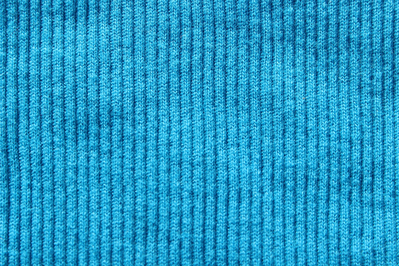
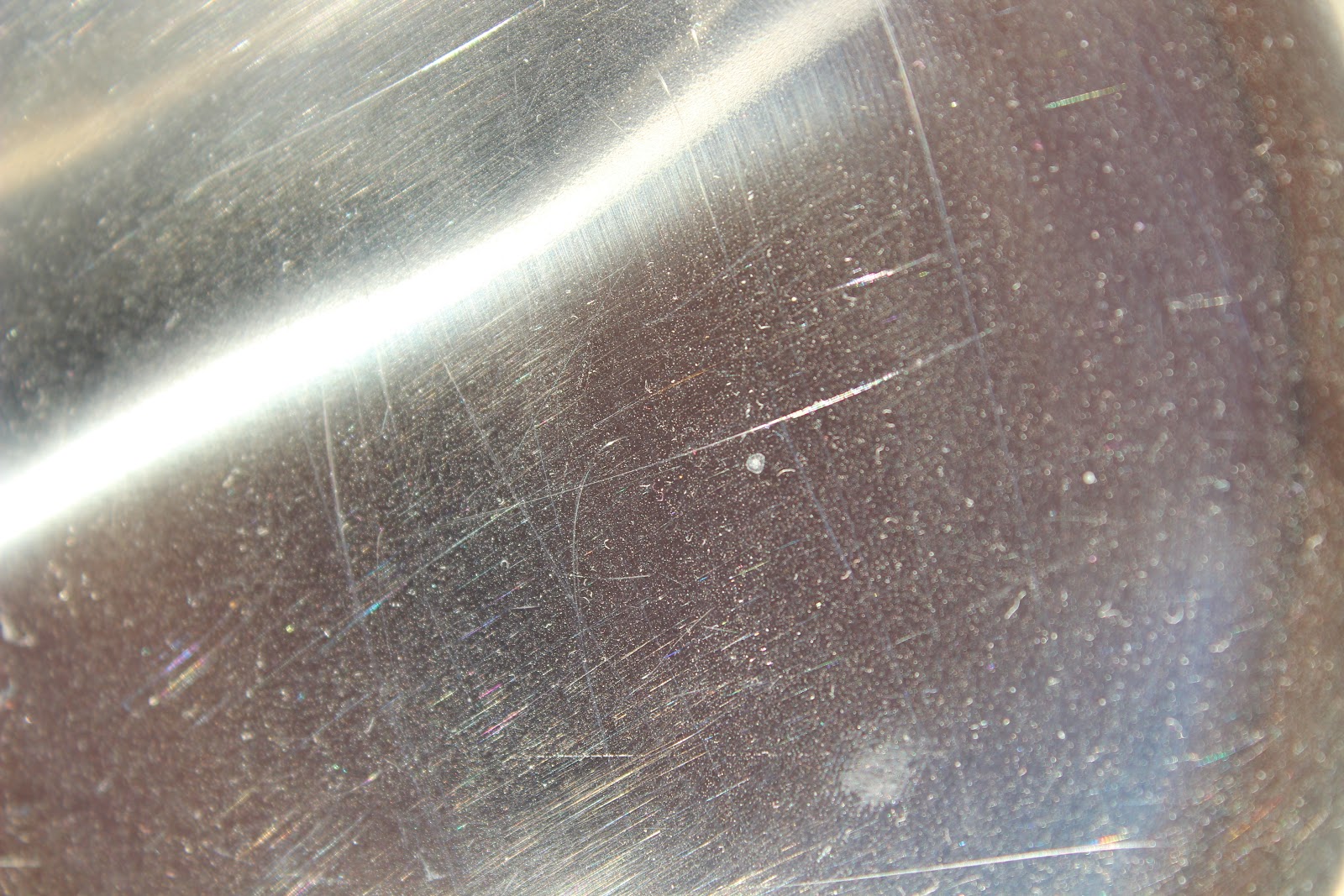
I have also begun arranging suitable locations to film my sports performance scenes in, I am in the process of talking with Clair Moore, the head manager at NTU's city campus gym to see if I can get permission to film in there with my actor and cameraman. A green screen session has also been arranged for next week. Other than that I have been on the lookout for good textures to incorporate into After Effects assets. A selection of my favourite are below:
After my initial inspiration search I began to brainstorm some rough ideas to incorporate into my kinetic typography themed promotional adverts, this included keys words and actions I wanted expressed in the lenghth of 45 seconds.
Integrated Electronics (word), After Effects electric particles, Heart beat monitor, Sports Performance, Thermal Glove and Effect, Beating heart, World map for security tagging, Green screen cloths, Character Profiles, Green screen Narrator, Mechanical Arm, Computer Chip, Company Logo, Silhouettes, Puzzle Pieces, Futuristic, Scientific. Fabrics.
I then went about formatting my ideas into a coherent structure by means of video story boarding, action and sounds are both displayed. My advert will have approximately six scenes running at an estimated five to ten seconds each.
As the brief consists of showing a slick, stylish advert and the company in question is very tech oriented, I believe displaying the majority of my advert via after effects would be suitable. This would allow the integration of futuristic looking visuals and fast-paced titles, content that would not be possible or practical to capture in live-action. I want to integrate live action footage, effects and titles in the spirit of kinetic typography... In the sense that each scene will transition dynamically to the next one via a camera movement or effect to create a fast-paced visually intense advert.
Here are some kinetic typography examples which sparked up a fair few ideas for title movements and backgrounds:
Notice the way something is always moving to retain the atmosphere,I particularly like the way the gunpowder streak in the batman kinetic typography leads to the next word, I believe i can achieve something similar but with electric current to representing the company's high tech products
I also wish to display their existing achievements and possible future achievements in a 'character profile' type set-up, these will show key words and imagery. For an example of what I'm talking about check out 5:53 of Deadly 60 below, I want to flick through the different products in a simular type scene.
"EngageMedia's purpose it to fulfill the increasing demand for fresh new
learning environments in the age of rapid technologically and communication advancements. Providing interactivity and learner styles which will not only
cater to the personal preferences and needs of students, but which can also be
applied to entice and engage audiences into clients products and services. We
are inspired to break down the barrier between the viewer and media,
eliminating the passive experience and replacing it with a rich, personalized
and rewarding accomplishment, ultimately leaving customers feeling motivated
and satisfied towards themselves and the product." - Samuel Dobson, C.E.O EngageMedia.
I'm back for another year after the summer and might I just add that the workload this year is absolutely crazy, with a new year comes a multitude of new briefs so let's get started. This brief consists of producing a slick, stylish (approximately 45-second) video with the express aim of documenting the work of the Advanced Textiles Research Group (ATRG).
The ATRG are manufacturing a range of innovative products in the medical, fashion, artistic sectors, they work involves the full integration of electronics into textiles, potential applications include performance and body monitoring, heat monitoring and textile communications.
They were 3 Briefs to choose from, I have decided to select brief number 3:
Create a short video that should document existing achievements of the group. This might be done through examining existing products that have come to market as a result of the research conducted by the group or through examining the technical breakthroughs achieved through the research of the group. It should discuss the group’s conceptual framework, highlight the key participants of the group; the products come to market and any technical breakthroughs already achieved. It should create a sense of anticipation of the future f this research.
I have made a commitment to my brief and intend to stick with it, I liked this particular brief more as I believe it is the broadest and leaves more room for experimentation.
Just some more after effects practice I did over the Holiday to stop myself from stagnating, they consist of title intros, flare elements and some 3D practice. I did a lot which I won't bore you with sharing on here, let's just say particular has given me some good ideas for year 3 :)
Over the Summer holiday I traveled to Austria and completed a personal photography project of mine, it had been in the works for some time and overall it was enriching experience, the ever growing vault of cinematography knowledge had been expanded. A selection of the best are available at flickr below:
As people are having some trouble understanding my idea I have decided to break it down into manageable scenes with a short explanation for each, I have also produced a visual aid to accompany each of the scenes, hopefully this will give a sense of the mood, pace and tension I am trying to achieve, as well as elaborating on the main story of the piece.
Scene 1
A mentally disturbed man who has recently been released from hospital is sitting crouched up in a dimly lit corridor, we cannot see his face. We hear mysterious voices and see that the man is experiencing a sequence of traumatic flashbacks, by the looks of it they have something to do with a letter. At the very same time a post vehicle is heading for the man's house, we see ourselves getting closer and closer to the man's house and front door, until eventually some letters are posted through the letterbox. The man hears the letters being posted and 'wakes up' from his psychotic episode in the utmost shock, the mysterious voices disappear and a sense of normality kicks in, it is as if he has woken up from a terrible dream. The man proceeds to stand up to go fetch the letters, he walks down the stairs and inspects his porch.
Scene 2
As the man is sorting through his letters he comes across one entitled 'DO NOT OPEN UNTIL TIME OF DEATH', at this point the mood begins to build tension, we see a look of terror on the man's face as he reads the title. He quickly walks out the front door in a hurry and proceeds to a old shack type building he has in his garden. He opens the door to his 'shack' and we see it's creepy interior, newspaper clippings everywhere, cobwebs and mysterious objects in jars and test tubes. The man paces up and down nervously, until he decides to sit down at a desk in the middle of the shack and inspect the letter once more, he is nervous, restless to the point where he can't keep his hands or body still, he is putting off opening the letter. He paces up and down the room for a while longer until he finally gives into the allure of the letter, we see him grab a letter opener.
Scene 3
The man rips open the letter to reveal lots of individual scraps of paper inside, he lifts it upside down and they all float down to his desk. The mood begins to get even tenser now, he starts to breathe heavy and aggressively looks through the scraps of paper for some sort of answer... until by luck he eventually pieces two pieces together. At this point we see that the scraps of paper in fact make up a photograph. He proceeds to tape the pieces together in a hurry, his breathing getting heavier all the time, until finally the complete picture is formed and repaired.
The tension stops and his breathing calms, we see him lifting the picture up to his face in complete shock, the picture is revealed to the audience , we see it is the man himself holding a gun up to his own head. He flips the picture around and on the back it reads 'patience was never my strongest virtue', before we have time to process what has just happened we hear a sharp noise behind him, the man jumps up and looks around, the scene fades to black. The scene is brought back and we see the man is dead, face down and lifeless on his desk, pools of blood surround him, we are left at the end with a shot of the photograph lying in a pool of blood.
Here is the mood board for my idea the letter, it includes shots from other films, shots I wish to use, colours and textures and the general feeling I want to incorporate into my Mystery/Thriller/Drama piece.
Treatment 1: The Letter: Arranging Your Own Death?
The establishing shot starts with a post delivery vehicle moving down the road. An unknown deliver man moves down the driveway through a first person perspective in day light, mixed into this shot is doley shot of a male ages 30-40 sitting face down on an the floor in a dimly lit room with a bluish tint. The fast pace of the alternating shots is brought to an abrupt end when the letter is finally slid in from outside, our character jumps up startled by the noise, revealing his face fully.
The next shot we see our character moving hastily down the stair from a quirky angle in daylight. he sorts through the letters, one of the letters is entitled, 'DO NOT OPEN UNTIL TIME OF DEATH'
At this point the mood becomes tense, we move to the kitchen, he sits down at a counter and begin to procrastinate, twiddling the letter in his hands, unable to sit still, the camera keeps cutting away to the title of the letter. He paces up and down the kitchen, finally stopping at the fridge with a serious expression on his face pondering whether or not to open it. He finally gives in and walks off screen, we cut to a shot of a letter opener being grabbed.
The man sits back down at the counter and a rips open the letter, he tilts the letter upside down and shakes, numerous shreds of paper fall out and float to the counter. We see the numerous pieces of paper closer, he moves the paper aggressively around until he rearranges two pieces by luck, we see that they are in fact the shredded remains of a picture.
We progress to a sequence of him taping pieces of paper together to try and reveal the picture, the music increases in pace. The music finally settles and we end with him slamming the picture down on the counter, we move to a tilt shot of him slowly lifting the picture to his face with a look of terror, The picture reveals the main character in a suit pointing a gun at the camera, he turns it around and the audience sees the writing 'you should have waited' or ' 'patience is my worst quality'
We hear a sharp noise and the character quickly looks behind him, it fades to black. The shot reappears from black and we see the man head face down on the counter, a gun is visible in the picture but distorted. We move to a final scene of a either (mailbox, desk, pile of letters) The camera comes into focus to reveal the letter once again.
Treatment 2: The Letter: How Is That Possible?
Same premise until the picture is revealed.
We go to an over the shoulder shot and the image is blurred, he turns it around and the audience sees the writing 'you should have waited' wrote on the back, we hear a sharp noise and the camera cuts away to a mid shot of the character quickly looking behind him, it fades to black. The shot reappears from black and we see a slightly out of focus close shot of the man head face down on the counter, the camera moves in and into focus on the picture which now sits on top of a pool of blood in his hand, we see the picture is in fact the exact scene that has transpired just moments before, the character has seen his own death before it has happened.
This version adds a hint of the paranormal, you could add the (mailbox, desk, pile of letters) scene at the end to add to the eerie phenomenon of the letter. Yet it still question the mentality of the character, had he imagined it?
Treatment 3: The Letter: We Know It Going To Happen.
Same premise until the picture is revealed.
In this version the audience gets to view the photo of the main characters death before it has actually happened, giving us the eerie realisation that he's witnessed his own death. He turns the picture around to reveal writing and hears a noise like the other two treatments. This treatment could leave out the death scene as we have prior seen it on the photo, leaving it to the audiences imagination. It could end with or without the mail box scene. This treatment has a stronger sense of the supernatural, he could be recalling the memory over and over or simply having a premonition.
The main central focus for my 90 second film is going to revolve around a letter, the working title is 'The Letter'The piece revolves around the central themes of questing reality, characters mentality, time and general mystery. Although my differing treatments alter the plot of the film slightly, the general idea is that their is character who receives an mysterious letter, the content of the letter questions the characters reality and the audience is left to decipher the outcome.
I have drawn influence from various sources, mainly other existing film. Notable influence include aspects from the film Memento (2000), the idea that a character cannot recall writing a letter to himself and posing for a photo struck me as particularly interesting.
Other influence comes from the film Fight Club (1999) as it deals with distorted reality's and questions the mental stability of the main character throughout, the idea that we see events through the blurred lens of a mental illness and that 'the truth' is somehow revealed to the audience at the climax is a big influence.
Another Small influence Come from The letter in Back to The Future, the one titled 'do not open until 1985', this is an interesting notion to explore, a mysterious letter through time.
Finally the premise of time repeating, a sequence of events occurring over and over has been explored, I felt this could be a thought provoking idea in my piece, the letter is being sent continuously, the event somehow restarts itself, leaving the audience wondering what came first and why it's happening,
the chicken and the egg scenario. It relates heavily to the plot that surround GroundHog Day (1993)
For this coursework I will produce a short 90 second film for entry into the DepicT film competition, there are no strict guidelines as such as DePict accepts a huge variety of mediums and genres: documentary, horror, animation and many more options are available to select if so desired.
From a first glance at the DePict website I notice that many pieces are simple yet elegant, they strive to display artistic vision rather than complex story lines and effects, a simple yet effective statement is present at the climax of many piece. For example I found 'Fag & Egg', a film that stands alone as artistic vision with little intrinsic meaning, and then there is a little gem entitled 'the Laundrette' that has a sweet simple message of love, mixed in off course with masterfully crafted and well thought out camera shots and lighting.
I believe this brief will be a breath of fresh air as I finally get to experiment with cinematography, creating the magic through interesting lighting and characters rather than Cgi and After Effects. Should be fun
Originally designed to be projected on stage behind a local Nottingham Hip-Hop group. The piece is intended to be a collection of abstract visuals, which harbour no identifiable storyline, plot or characters.
Basically it was meant to deviate from the conventions of the cliché' rap video, e.g. cars, girls. The Key themes are Mirrors, Death, Time, Energy and Anger. The extra two minutes at the end when the song repeats were designed in case the band performs over schedule.
I used a lot of After Effects and filmed most green screen and live footage using the Canon 7D. This work was also assigned by the Nottingham design agency Urban Angle.
Here is my completed show reel assignment for 2012 with motion dvd menu integrated, the DVD version is slightly shorter with ducking audio.
Hi my name is Samuel Dobson and I am currently studying multi media at Nottingham Trent University, Although I do have knowledge In both interactive space and 3D animation, my prevailing speciality Is In moving image.
Film has always absorbed me personally, even from an early age.I believe it is the most effective way to express my creativity, entertain people and portray information.
This is my showreel for 2012, it includes various short films, visual effects, photography/photoshop and 3D animation.
Well kinda, nothing huge but it's worth a mention here, remember my last project? The political advert I made about foul ingredients found in everyday fast foods? Well that very video has been embedded on http://www.fittvo.com. Fit TeleVision is an online service which offers content that helps users find a range of information on daily fitness and fitness products. Maintained to keep up to date on topics and products relevant to users and provides information on a variety of health related topics.
I discovered I was on their site while analysing my monthly youtube view statistics, a large amount of views were being redirected from an external embed on a mysterious site. I browsed through Fittvo's article base and discovered a post entitled: Mechanically Seperated Meat:www.fittvo.com/6174/mechanically-separated-meat/
Sure enough my video is there at the very bottom, the article shares very similar themes, concepts and view points to my political advert, it's nice to see that the intended meaning I designed, which was: to inform the public to think twice about ingredients found in their food, has been recognised and related to by Fittvo. It makes me happy to think that maybe just two or three people have been inspired by my video after a viewing on this article, makes it all worth while.
There has been heaps of development since the last design practise 3 post I wrote here, two separate filming sessions have gone by, scenes have been built up in after effects and tweaked. Finally new ideas entirely for scenes have formed around the development of my existing ideas and I'm working on incorporating them into the 4 and half minute music video.
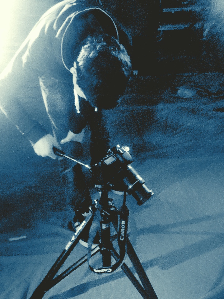
Lets start with the filming sessions as that's a chronologically suitable place to start: my first session fell last Wednesday and was a combined arrangement by me, Jordan Brooks and Joe Burns, we helped each other set up equipment and act/model in each others videos. The lightning went well, we had an evenly lit green screen with no shadows and a correct exposure on the 7D. A main outstanding problem I believe disrupted filming and limited what I could achieve was the inherent time restrictions we had on our DSLR camera.
I hate being rushed and that's exactly what it felt like, we had the camera 10 - 4 for one day so some scenes didn't turn out the way I'd hoped, it was cramming at it's finest. I later had a contingency shoot day the following Monday with Chris Thorby which allowed me to replace previous bad footage and collect new material, I also had the chance to experiment with my new time lapse timer in Nottingham Square, i was pleased with the result.
Moving on, I'm not going to document the entire process of editing my assets, as frankly it would bore and take to much space, I'll give you a basic overview of progress. The main scenes I have started work on and subsquentially almost completed are: Scene 1: Man In Mirror:
Scene 2: Mirror Scale
Scene 4: Flickering Room
Scene 9: Alive in Toilet Mirror
Scene 13: Time lapse at Nottingham Square
New Scene: Passing through mirror
In conclusion I proberly over estimated what I needed to film to make this video, I'm about 2 minutes into the song and i don't think I'm going to need to produce every last scene, so a few will be scrapped. Besides resources for the project are dwindling so I'm going to use what I've got for now. Another thing to note is that I do think the whole thing is a bit after effects heavy, I'm starting to feel like a computer hermit, I'm looking forward to the 90 second drama FILM next project.