Just some more after effects practice I did over the Holiday to stop myself from stagnating, they consist of title intros, flare elements and some 3D practice. I did a lot which I won't bore you with sharing on here, let's just say particular has given me some good ideas for year 3 :)
Retro/Futuristic Title Intro
Planets Align

Showing posts with label Personal. Show all posts
Showing posts with label Personal. Show all posts
Sunday, 30 September 2012
Independant Project: Autrian Photography
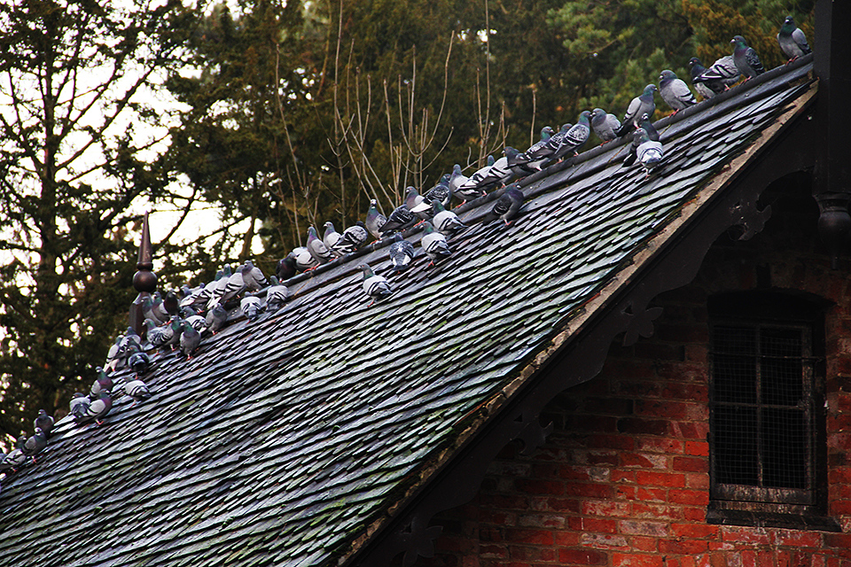
Over the Summer holiday I traveled to Austria and completed a personal photography project of mine, it had been in the works for some time and overall it was enriching experience, the ever growing vault of cinematography knowledge had been expanded. A selection of the best are available at flickr below:
HERE!
Here's one of my faves:

HERE!
Here's one of my faves:

Friday, 2 March 2012
Claim To Fame.
Well kinda, nothing huge but it's worth a mention here, remember my last project? The political advert I made about foul ingredients found in everyday fast foods? Well that very video has been embedded on http://www.fittvo.com. Fit TeleVision is an online service which offers content that helps users find a range of information on daily fitness and fitness products. Maintained to keep up to date on topics and products relevant to users and provides information on a variety of health related topics.

I discovered I was on their site while analysing my monthly youtube view statistics, a large amount of views were being redirected from an external embed on a mysterious site. I browsed through Fittvo's article base and discovered a post entitled: Mechanically Seperated Meat: www.fittvo.com/6174/mechanically-separated-meat/

Sure enough my video is there at the very bottom, the article shares very similar themes, concepts and view points to my political advert, it's nice to see that the intended meaning I designed, which was: to inform the public to think twice about ingredients found in their food, has been recognised and related to by Fittvo. It makes me happy to think that maybe just two or three people have been inspired by my video after a viewing on this article, makes it all worth while.
Tuesday, 24 January 2012
Kin and Cosmos. (Elvaston Castle - Music Video) [HD]
Basically a gloryfied family home movie, filmed on a clear day at the Elvaston Castle Public Estate In Derbyshire. Main purposes served were to test out the Canon 7D, try colour correction, sequence clips to music and test various other effects.
Photographs taken on the day and later Photoshopped can be found here:
http://www.flickr.com/photos/56511472@N08/sets/72157628969060289/
Derbyshire County Council plan to lease the estate to a private owner who plans to turn the estate into a hotel and golf complex. Please pledge your support to keep the beauty and rich history of Elvaston Castle alive to the public below:
http://www.elvastoncastle.org.uk/index.htm
Music:
"Silverspoon" by Meanwhileproject.ltd (http://www.myspace.com/meanwhileprojectltd)
Tuesday, 17 January 2012
Canon 7D Practice
Ahhh my weakest point, camera technicality. I do have a very basic overview of how to operate a camera, I know about focus and the iris and also what format to record in, yet the finer points still allude me. As I don't come from a photography background and have never really been exposed to high end photography cameras such as SLR's and DLRS' I decided it was about time I learnt some basic skill and understood some of the terminology. I hired out a Canon D7 for the weekend to try and get to grips with how it works, this way when I film for real I'll not waste a load of time. I learnt three invaluable lessons.
1) Exposure is a mixture of ISO (the sensitivity at which your camera reacts to light, like volume on a radio) The Aperture (The amount of light let into the lens) and Shutter speed (The amount of time the shutter stays open to capture the light), You use all three settings to attain Good Exposure, adjusting for required scenes and situations.
2)The shutter speed is measured in seconds and fractions of seconds, opening it for longer can create a blurred effect on motion objects, such as waterfalls and moving light sources and is vital for recording time lapse photography, a faster speed takes a more crisp photo, such as on a fast car moving. Can also be used on record mode, you generally film at twice the speed as your frame rate, so 25fps would equal 1/50 shutter speed
3) The Aperture creates a depth of field it is measure by a Focal Value, so F2, F8, remember to press the depth of field preview button.
4) 100-400 ISO is a sunny day 400-800 indoors or evening and 800-1600 night time.
5) You must select the correct mode for the job, aperture priority for landscaped and portraits, shutter priority for moving objects and I believe Manuel if you want to experiment with the two.
Here's the good photo's I got with photoshop editing:


Sunday, 8 January 2012
Bruce Block: The Visual Story: Chapter 3: Space: Part 2
Carrying on from part one, the next space element identified is Flat Space. This type of space is opposite to that of Deep Space, it is the actual 2D space of an object or scene, no depth illusion is created. To achieve this effects the camera must be kept frontal and objects must all be positioned parallel to the camera to avoid size difference.

Other way to achieve flat space are to avoid object movement perpendicular to the camera, keep all movement parallel. You can also use Pan's, zooms and tilts, these don't create any depth cues as all the objects move in unison, there is no relative movement, with a zoom for example everything gets larger simultaneously.
Other ways to maintain flat space are to: have a detailed background, overwhelming ariel diffusion, no difference in tone, singular colours, same height in objects, no overlapping and blurred objects. It is also noted that reversing the deep space depths cues will often create a flatter image, for example having darker tones in foreground and lighter tones in background.
Limited Space is in between deep and flat space, it can only use frontal planes and can only use movement parallel to the camera, this eliminates the two strongest deep space visual cues. Yet you can maintain any other element mention before hand to create the illusion of depth. For example using multiple frontal planes with size difference and tonal separation would be limited space, think of it as two or three elaborately placed layers of glass in front of the camera.

Ambiguous Space is the final type mentioned, this replies on creating anxiety and a tense mood, often found throughout horror and thriller films. The tense mood come from being unable to identify the size and relationship of objects in frame, it is often achieved by tonal and textural camouflage (shadows and lights), mirror and reflections and disorienting camera angles, it is noted that for the effect to work the objects must be of unknown size.

Controlling space during production
Deep Space
1) Emphasise longitude planes
2) Use size change, arrange objects perpendicular to the camera, small in BG, large in FG. keep movement perpendicular
3) Move the camera, link movement to dramatic purpose
4) Tonal separation, light to dark, warm to cold
5) Use wide angled lens
Flat Space
1) Eliminate longitude planes
2) Stage objects parallel to picture plane, all movement parallel
3) Don't use dolly or crane movement, pans and zooms fine
4) No tonal separation, all one colour
5) Use telephoto lens
6) Use blurring
Part Two: The Frame
The second section of the chapter discusses space in relation to the size of the real world picture frame not just what we see in the screen world. Aspect ratio is explained, it is when you compare the portions of height of a frame to the portion of width, height is always 1, while width is how many times greater than the height it is. For example if a screens width is 200x and the screens height is 100x, the aspect ration would be 2.0:1, as the width is two times the size of the height.

 Contrast and Affinity
To summarise we learn that everything in the space chapter including surface divisions, deep space, flat space, limited space and ambiguous space can be related back to contrast and affinity. contrast and affinity of space can occur in shot, from shot to shot or from sequence to sequence. For example you could shoot a flat space to deep space shot to show contrast, or divide flat and deep space using surface divisions to show a contrast. Keep everything the same for several shots and you have affinity of space, mix contrast and affinity for best results. Deep space is however more inheritenly intense so keep that in mind, finally experiment to find out what works best for you

Other way to achieve flat space are to avoid object movement perpendicular to the camera, keep all movement parallel. You can also use Pan's, zooms and tilts, these don't create any depth cues as all the objects move in unison, there is no relative movement, with a zoom for example everything gets larger simultaneously.
Other ways to maintain flat space are to: have a detailed background, overwhelming ariel diffusion, no difference in tone, singular colours, same height in objects, no overlapping and blurred objects. It is also noted that reversing the deep space depths cues will often create a flatter image, for example having darker tones in foreground and lighter tones in background.
Limited Space is in between deep and flat space, it can only use frontal planes and can only use movement parallel to the camera, this eliminates the two strongest deep space visual cues. Yet you can maintain any other element mention before hand to create the illusion of depth. For example using multiple frontal planes with size difference and tonal separation would be limited space, think of it as two or three elaborately placed layers of glass in front of the camera.

Ambiguous Space is the final type mentioned, this replies on creating anxiety and a tense mood, often found throughout horror and thriller films. The tense mood come from being unable to identify the size and relationship of objects in frame, it is often achieved by tonal and textural camouflage (shadows and lights), mirror and reflections and disorienting camera angles, it is noted that for the effect to work the objects must be of unknown size.

Controlling space during production
Deep Space
1) Emphasise longitude planes
2) Use size change, arrange objects perpendicular to the camera, small in BG, large in FG. keep movement perpendicular
3) Move the camera, link movement to dramatic purpose
4) Tonal separation, light to dark, warm to cold
5) Use wide angled lens
Flat Space
1) Eliminate longitude planes
2) Stage objects parallel to picture plane, all movement parallel
3) Don't use dolly or crane movement, pans and zooms fine
4) No tonal separation, all one colour
5) Use telephoto lens
6) Use blurring
Part Two: The Frame
The second section of the chapter discusses space in relation to the size of the real world picture frame not just what we see in the screen world. Aspect ratio is explained, it is when you compare the portions of height of a frame to the portion of width, height is always 1, while width is how many times greater than the height it is. For example if a screens width is 200x and the screens height is 100x, the aspect ration would be 2.0:1, as the width is two times the size of the height.

It goes on to say that, anything which divides the frame into two or more areas is classed as a surface division, it can be shown by a visual split screen or an actual object in shot. For example it could be a door way, or a tonal change in a wall, a lighting change. Horizons can create a division in the middle, a doorway could create a rectangle division, a division of thirds could be a set of windows, surface division can emphasise similarity and difference between objects, the audience will compare and contrast each area of the frame.

To summarise we learn that everything in the space chapter including surface divisions, deep space, flat space, limited space and ambiguous space can be related back to contrast and affinity. contrast and affinity of space can occur in shot, from shot to shot or from sequence to sequence. For example you could shoot a flat space to deep space shot to show contrast, or divide flat and deep space using surface divisions to show a contrast. Keep everything the same for several shots and you have affinity of space, mix contrast and affinity for best results. Deep space is however more inheritenly intense so keep that in mind, finally experiment to find out what works best for you
Tuesday, 3 January 2012
Bruce Block: The Visual Story: Chapter 3: Space: Part 1
I have advanced onto chapter three of Bruce Blocks: The Visual Chapter, this chapter makes up about 30% of the book and concentrates on the complex nature of space in cinematography, both in terms of the space in the screen world (which will be discussed in this post) and the space in the real world, aka aspect ratios and the picture frame, which will be discussed in part two.
Deep Space is the first space element we learn. Deep space is the illusion of depth through specific depth cues. Think of it this way, if your viewing a flat plane such as a wall straight on it has no depth, however if you move the camera to the side you reveal depth, a One Point Perspective is created when the verges of an object appear to disappear into the distance, a classic example of this would be looking at a railroad track.

A Two Point Perspective uses two vanishing points, this can be created by lifting or lowering the camera so an object appears unparallelled, or simply by using two surfaces of an object, such as the corner of a building or the corner of a room. A 3 Point Perspective can be achieved by say altering the height of an image that has two surfaces to create a third vanishing point, for example looking up on a cornered building. Perspectives can be achieved on any object even actors, tilt the camera up or down and an actor gains perspective. Positioning objects in between vanishing points draws attention, changing from one perspective to another can be considered a visual progression.


Size Difference is when you position objects and actors in the forgroud, midground and backgroud to create depth, it is sometimes called staging in depth, objects in the FG will appear large while objects in BG will appear smaller.

Object Movement: parallel is any movement that is left, right, circular or diagonal to the picture plane, where as perpendicular is movement towards or away from the camera, either straight on or diagonal. Objects moving in The FG, MG and BG will create depth. Relative movement is created when two objects, one in FG and one in the BG move simultaneously, the background movement will appear to take longer than foreground movement, this all adds to the illusion of depth, a good example of parallel movement would be a man walking from the left of the screen to right, a good example of perpendicular movement and relative movement would be a plane taking off.
Camera Movement: Dolly movements creates depth between the Foreground and the Background, the Forground would appear to get larger faster than the Backgroud. The same occurs with tracking, the Foregroud will move past faster than the Backgroud creating a depth cue, same goes for crane shots, The foreground will dissapear quickly while the backgroud barely moves.
Deep Space can also be created by Diffusion, there are two types of diffusion Textual and Ariel. Textual is created when an object texture and detail diminish and become distorted, the more distorted an objects texture the further away they appear to be. Ariel is created by particles in the air, for example on a foggy day texture in the background will appear more diffused which creates depth. For diffusion to work you need an effected and unaffected appear.

Tonal Seperation, this one is reltively simple, viewers tend to percieve dark tones as further away than lighter tones, the same applyes to colours, the viewer would percieve a cool colour such as blue to be further away then say a warm colour such as red.

The last two depth cues are Up/Down Positioning and Focus, objects and people who are lower usually appear in foreground while higher objects and people appear further away. As for focus, a blurred backgroud will appear further away, while the unblurred object will appear closer.
Part Two covers Flat Space, Limited Space and Ambiguous Space

Saturday, 31 December 2011
Bruce Block: The Visual Story: Chapters 1 - 2
So I've just started to skim the surface of Bruce Blocks: The Visual Story, my reading pace seems quite staggered, but I believe that's due to the long recap period required after each chapter. Every page is riddled with diagrams and examples of films to check out, a lot of information in a small amount of space, it can take a while to grasp and fully understand a single point made.
The main outstanding notes I have made for Chapter 1 & 2 are as followed;
There are three main elements to any film production, these are categorised as
- Story: Building blocks of plot, character and dialogue
- Sound: Building blocks of dialogue, sound effects and music
- Visuals: Which is built upon; The Basic Visual Components;
- Space: the physical space in front of camera, the space on screen, the size of the screen itself.
- Line and Shape: lines make up and appear to create all shapes
- Tone: the brightness of an object relative to the grey scale
- Colour: the most powerful visual component
Visual component can portray emotion and messages to the audience, perfect example for sound is the music in Jaws and Psycho which communicates terror.
A perfect example for colour would be that red indicates danger, its a stereotypical and well known colour for it, but you don't have to stick to conventions, blue could show danger if portrayed to the audience enough.

The next major point made is that of Film progression, diagrammed simply as a point transforming into a line, transforming into a cube, something starting off as simple and evolving into something complex. Examples in films include;
Raging Bull; Fight scenes start of as very simple and end very complex
The Birds; The birds are constantly gathering more and more to attack
The North by Northwest cornfield scene, the scene progresses from very dull to high intensity.
We are introduced to contrast and affinity, a perfect example of tonal contrast would be a black silhouette on a white background or Visa Vera, a perfect example of tonal affinity would be two colour next to each other on the grey scale overlapping.
The more contrast in any visual element the greater visual intensity, the more affinity the less visual intensity. The whole point made was that you need a good mix of contrast and affinity if you are to hold the audiences attention, if there is no contrast to the story, dialogue, visuals etc the audience becomes bored, if there is too much with no affinity it becomes too intense, basically you need good pace to a film.


The main outstanding notes I have made for Chapter 1 & 2 are as followed;
There are three main elements to any film production, these are categorised as
- Story: Building blocks of plot, character and dialogue
- Sound: Building blocks of dialogue, sound effects and music
- Visuals: Which is built upon; The Basic Visual Components;
- Space: the physical space in front of camera, the space on screen, the size of the screen itself.
- Line and Shape: lines make up and appear to create all shapes
- Tone: the brightness of an object relative to the grey scale
- Colour: the most powerful visual component
- Movement: to attract the eye via objects on camera
An actor is part of these visual components, no difference between them and other objects, still use space, lines, shapes, tones, colours and movement.Visual component can portray emotion and messages to the audience, perfect example for sound is the music in Jaws and Psycho which communicates terror.
A perfect example for colour would be that red indicates danger, its a stereotypical and well known colour for it, but you don't have to stick to conventions, blue could show danger if portrayed to the audience enough.

The next major point made is that of Film progression, diagrammed simply as a point transforming into a line, transforming into a cube, something starting off as simple and evolving into something complex. Examples in films include;
Raging Bull; Fight scenes start of as very simple and end very complex
The Birds; The birds are constantly gathering more and more to attack
The North by Northwest cornfield scene, the scene progresses from very dull to high intensity.
We are introduced to contrast and affinity, a perfect example of tonal contrast would be a black silhouette on a white background or Visa Vera, a perfect example of tonal affinity would be two colour next to each other on the grey scale overlapping.
The more contrast in any visual element the greater visual intensity, the more affinity the less visual intensity. The whole point made was that you need a good mix of contrast and affinity if you are to hold the audiences attention, if there is no contrast to the story, dialogue, visuals etc the audience becomes bored, if there is too much with no affinity it becomes too intense, basically you need good pace to a film.


Thursday, 29 December 2011
Bruce Block: The Visual Story: The Beginning

"You hold in your hand the key to understanding the complex and ever changing world of modern cinema" Jay Roach, director of Austin Powers, Meet the parents and Meet the Fockers
"Bruce Block masterfully deconstructs visual storytelling. Exposure to this material is essential for all students of cinema. This book will make you a better film-maker!" - American Film Institute

It all sounds very promising, lets hope it's not a load of commercial hype. Over the next week I will be dissecting and analysing all the material found in this piece, proberly about two to three chapters at a time and recapping on this blog. I will cite examples and my own personal thoughts on the theories found throughout this book, mainly so I can future reference and understand better what I am reading. Hopefully after I will become a better film-maker and apply this newly found knowledge to work next term
Tuesday, 27 December 2011
Review: Mac and Me (1988)
 I had absolutely no expectations going into this movie, I was merely inspired to watch it by overseeing a fellow student viewing a trailer in class. Firstly I'd like to say I was completely unaware of the stigma attached to this piece and atop of that (in which I'm ashamed to admit) was viewed before Steven Spielberg's E.T., with all this in mind I believe my viewing experience was possible improved tenfold, as I had no prior bias or bandwagon opinion to jump upon.
 Mac and Me begins on what I can only assume is Mars, following a family of four (obviously puppet) aliens as they investigate a strange space probe landing on their planet, sequentially being sucked up by the machine and transported to the planet Earth. The first thing to note is that If you over analyse the special effects in this movie and compare them to the standards of today, off course you're going to come up disappointed, however take them as comedy and treat this piece as a B-movie and you'll reap some pretty funny rewards.
 As the film continues we watch as the alien family, now dazed and confused from their journey get separated, leaving Mac, the youngest of the family to survive on his own. After causing a traffic accident by colliding his obviously rubber body into a nearby car's windshield (hilarious), he takes it upon himself to hitch a ride on the backseat of a family's car. The human family whom are unaware of Macs existence arrive at their newly purchased property in Americaville and begin to settle in, Eric, the disabled lonely child of the family begins to suspect somethings a miss when he experiences electrical disturbances throughout his house, along with waking up to a full redecoration of his living room to imitate Mac's home planet. This is when Eric finally discovers Mac and we have to endure the loving, heart-felt relationship only a disabled boy and his alien could experience. That's pretty much the plot along with some cliché government guys trying to recapture Mac for evil experiments and Eric taking it upon himself to reunite Mac with his freaky anorexic family lost in the desert.
The scenes that will provide most enjoyment for those who allow themselves to derive guilty laughs from bad movies are when; Eric loses control of his chair, leaving him falling down a steep ravine to his imminent doom, the spontaneous random dance off at MacDonald's, the countless-shameless product placements throughout and finally the penultimate petrol station explosion scene which see's the formerly P.C alien family obliviously popping caps at local police authorities and gas pumps.
In conclusion I can completely understand why this movie is the target of so much abuse, everything Is incredibly amateur, plagiarised and predictable, however by no means am I suggesting that it's not enjoyable to watch, it's packed with charm, love and silly fun, in the end this is a children's movie and the magic it provided to kids is what counts, do you think it would have been an issue to young Timmy in the 80's if there was product placement and it was similar to E.T? No, get off your high horse and respect the fact that people can and did enjoy this film.


Wednesday, 14 December 2011
Review: Scarface (1983)

The film revolves around a Cuban refugee, who after escaping the holding camps in Miami, seeks to rise to the top of the international drug empire.
Tony's characteristics and actions take the centre stage throughout, they are some of the most intriguing I've ever seen, more so then any other recent character I can remember. From act one we are presented with this reckless, dominant and highly ambitious man who doesn't seem to feel fear, he has a certain unstoppable momentum about him, incredible stage presence for a character that in reality is just a mere man. Excellent facial expressions throughout adds to Tony's larger than life persona, he looks so calm, almost bored in the mist of drug deals and shootouts, as if reality isn't worthy of his attention.

All in all I highly enjoyed Scarface, it had enough action sequences to satisfy my bloodlust along with an array of interesting characters to bring meaning and substance to the film. The message portrayed is one to remember, don't obsess over wealth and power, nothing good ever comes out off being overly materialistic, value what's real.. and cocaine is a hell of a drug.

Sunday, 27 November 2011
After Effects CRAZY!
Yep, so After Effects had pretty much been my creative zen this past week, I'm working under the philosophy that It'll be less painful to learn now than a year down the road, when the vast majority of employers and clients are going to want to see evidence of AE competency... film and visual effects are becoming ever more intertwined and I believe it's a necessity to understand both in this modern society. More importantly though I want to gain a greater understanding of how this technology can be incorporated into my projects personally. How can I work out future scenes if I don't realise what AE is capable of?
I'm finding it quite complex at the moment, more so then any other program I've used (bar 3ds MAX), but that's fine as it is in fact widely considered a steep learning curve for most beginner. So all in all I feel that I can gradually build up my knowledge of the program through online tutorials and my project time at University, the plan is that by the end of my course here I will at least be of average standard in AE and be able to confidently incorporate VFX in my work flow.
I'm finding it quite complex at the moment, more so then any other program I've used (bar 3ds MAX), but that's fine as it is in fact widely considered a steep learning curve for most beginner. So all in all I feel that I can gradually build up my knowledge of the program through online tutorials and my project time at University, the plan is that by the end of my course here I will at least be of average standard in AE and be able to confidently incorporate VFX in my work flow.
Friday, 7 October 2011
First week back
After much soul searching I have decided to transfer from 3D animation to moving image, after just the first week of attending the 3D classes I came to realisation that it was something I felt very little confidence and passion towards and believed I would never be motivated to push myself and excel within it. More than the just the programs being hard to pick up is the fact that I'm not the most artistically talented in terms of drawing and have little interest in modelling, I would not enjoy this side of it. I believe I have made the right choice as it is apparent now that I should do something I'm passionate about rather than just what I think is the most challenging. I could work with others and maybe enjoy myself in the process instead of struggling and fighting with what I'm naturally good at.
What may have been...
What may have been...
Monday, 11 April 2011
Music Video For A Client.
Avegastar - Calling All Fears - Music Video by MediaDobson
I forgot to post this a couple of months ago, but I'll put it up now. I directed and produced a music video in my spare time for a local alternative rock band named 'Avegastar'. I planned out everything from the story scenes to the film noir lighting and the various camera shots. I was trying to create a visual representation of fear and the effects it has on a individual mentally, as well as blending in a high energy performance from the band. I made this before I had chosen the animation pathway and I did it mainly to see if I would prefer the moving image pathway, it gave me some good practice and an interesting insight into how I would feel selecting film for year 2.
Wednesday, 6 April 2011
I've Finally Got Um': Visual Essay Update!
I won't go into in-depth detail to how I came to the decision (that's what the essays for) but the pathway I've finally decided upon and which I am selecting for the 2nd years is...

My Four Practitioners:
 1. Shingeru Miyamoto (Nintendo) - It wasn't a difficult selection, as the picture indicated Shingeru is a incredibly influential game designer and fits nicely in at the start of my essay, he represents my early discovery into the world of game animation. He's been creating pioneering, industry-shaping video games and hardware for nearly three decades. His contributions have been blatantly copied by competitors just as much as they've been applauded by players around the world. His resume includes greats such as: Donkey Kong, Mario Bros., and The Legend of Zelda, Mario Kart, F-Zero, Star Fox and Super Mario 64.
 2. Phillip Dobson (

 4. Hayoa Miyazaki (Manga, Animator, Film Director) - A more modern discovery of mine rather than an early childhood inspiration this time, Miyazaki who has attained international acclaim as a maker of animated feature films. His work visually and imaginatively is on a completely different level to anything else out there, the unique beauty of his animations display intelligent meaning on; nature, life and love. I truly believe that animation is special, that it has the power to take you to unimaginable places of magic, where the possibility's are endless and restrictions are non-existent. This is something that other media forms cannot achieve. His work is the best example I can think of that reinforces that idea, it represents animation as more than child's entertainment but as an art form. His resume includes: Spirited Away, Howl's Moving Castle, Castle in the Sky, Ponyo and more

My Four Practitioners:
 1. Shingeru Miyamoto (Nintendo) - It wasn't a difficult selection, as the picture indicated Shingeru is a incredibly influential game designer and fits nicely in at the start of my essay, he represents my early discovery into the world of game animation. He's been creating pioneering, industry-shaping video games and hardware for nearly three decades. His contributions have been blatantly copied by competitors just as much as they've been applauded by players around the world. His resume includes greats such as: Donkey Kong, Mario Bros., and The Legend of Zelda, Mario Kart, F-Zero, Star Fox and Super Mario 64.


Monday, 7 March 2011
Recap: 2nd Year Student's and Pathway Choices!
This week has been information overload for me, I've been contemplating my pathway choice for months now, desperately searching for something to tilt me one way or the other... moving image, virtual environments, moving image, virtual environment, moving image, virtual environments e.c.t.
The deal is that I am passionate about both, different stages of my life have been dominated by the two at different times, for example I studied A-level film at college and watched/made film throughout my childhood, but in more recent years a big chunk of my aspirations and spare time has been dreaming about being involved in animation in someway, partly influenced by my increased interaction with games and animated films/shows.
It's a really tough decision, my life could go either way and I really want to make the right choice, I need to make a educated selection, so I'm trying to weigh up the advantages and disadvantages, another thing for me to recognize is that since I started University i have almost been daring myself to choose animation for a challenge and have found it more difficult but more interesting than the others, It's like a personal wrestling match between the two. My cousin has also made a successful career in the animation industry, so there's that as well.
So on Monday we got the the opportunity to listen and Q&A with second year students about there pathway choice, Another interesting matter I noticed was that I only took notes down from the animation speaker (that could say something in its self)
Notes:
Animation:- Photoshop Crucial
- Do your visual essay in the medium your choosing
- Need some drawing skills
- Do more projects than just uni, enter competitions, challenge friends
- Time management and Pipelining
- Buy a powerful Desktop Computer
- Do a lot of independent research and practice
- Follow current practitioners and techniques
- A lot of hard work, up late at night, but rewarding
- Don't have to work in groups
- A lot of time spent in front of computer
- Decent Pay
In conclusion If i can get past the intimidation of VE and embrace that I will have to learn and learn, I'm positive I would find virtual environments enjoyable, I just need to decide if I've got what It takes. Will be confirming shortly.
Calum Whitehead's (Second year student) visual essay:
This has sparked a fair few ideas
Thursday, 30 December 2010
Done Anything Creative Over Christmas?
In between the mad rush of Christmas and new years eve, I found a gap to experiment and improve my skills in certain areas of design, It was a toss up among learning more about 3DS max or Photoshop. For some odd reason a lot of people are experienced in photoshop from use at college and from an early age (I think I missed out there) and have a good understanding of it, so to not risk being a photoshop novice I decided to play around with it.
I took a picture of WWII fighter plane and manipulated it to look as if it had been shot down and was on fire, using tools such as hard light, layer masks, smudge and noise. It's a lot different from Microsoft paint :)
Original Image:

Photoshoped:

Finalised on a background:

I also designed the Christmas tree with contrasting colours, silver and gold baby, ooh yeah lol

Samuel Dobson
Monday, 18 October 2010
My Multimedia
NEXI - Robot with facial expressions

A new invention by MIT Media lab is a new robot that is able to show various facial expressions such as 'slanting its eyebrows in anger', or 'raise them in surprise', and shows a wide assortment of facial expressions while communicating with people.
This particular new technology piques my interest as I believe the evolution of robots could change our world extremely, we already live in age where technology aids our everyday lives , the possibility of improving human/robot teamwork in the future will open up many possibilities and controversies. The robots we have at the moment are great for perfectly completing tasks on the production line and can accurately design anything we want them to, but what interests me is when it gets to the point where robots function in the domestic environment, helping us put dishes in the dishwasher and cooking meals for us.
Anyway this new invention tells me that were getting closer and closer to breaking the limitations of everyday robots, I can't imagine people enjoying a realistic expression on a robot, personally It would make me really uncomfortable, but it will be very interesting to see how these new technology's can be used to further the development of human kind, for better or worse.
CREEPY!
Saturday, 9 October 2010
Whiteboard Animations
To get a taste of what's to come and to get involved in some active learning with my fellow students, I took part in a whiteboard animation session. This involved one shot filming of whiteboard marker characters and objects, moving them slightly every shot to create a stop motion effect. I learnt that you need more frames to create one second of film than I realised. It was a good group exercise and served it's purpose of getting us in the spirit of what's to come and helping us to get to know each other.
Samuel Dobson
Finished result below:
Samuel Dobson
Finished result below:
Tuesday, 28 September 2010
Setting out on a new journey!
This is the beginning of the bumpy road to the multi-media world, I hope to discover where my talents really lie, be motivated to explore new media forms and also to be pushed to reach my full potential. I chose this course as media has always allured me, even from an early age, the way media effects our lives is more important than anything to me.
I hope in 3 years, people will be enjoying and interacting with media I have helped produce, that would give me great satisfaction. Lets wait and see which doors open and which doors close.
Samuel Dobson.
I hope in 3 years, people will be enjoying and interacting with media I have helped produce, that would give me great satisfaction. Lets wait and see which doors open and which doors close.
Samuel Dobson.
 |
| Waverly Building Nottingham: Center of Operations |
Subscribe to:
Posts (Atom)